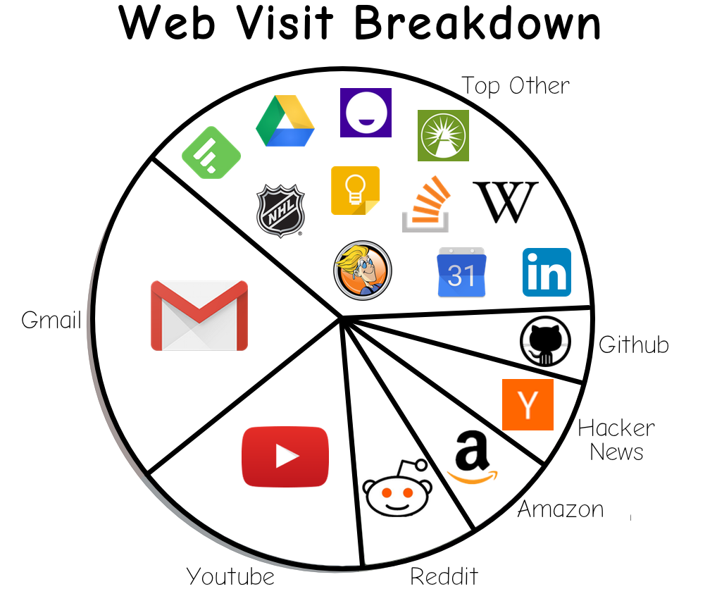
After unconsciously visiting gmail two dozen times within the last hour, I acquired the urge to quantify my web usage behaviour. Surely, checking websites at this frequency wasn't normal - right?
Alas, after compiling a year's worth of web history, this definitely wasn't the exception to the rule. So, in order to obscure some depressingly large numbers while still showing my web usage, I'll just present the data as everyone's favorite-to-hate visualization - a pie chart:
